Daskey — Luxury Fashion E-commerce Design
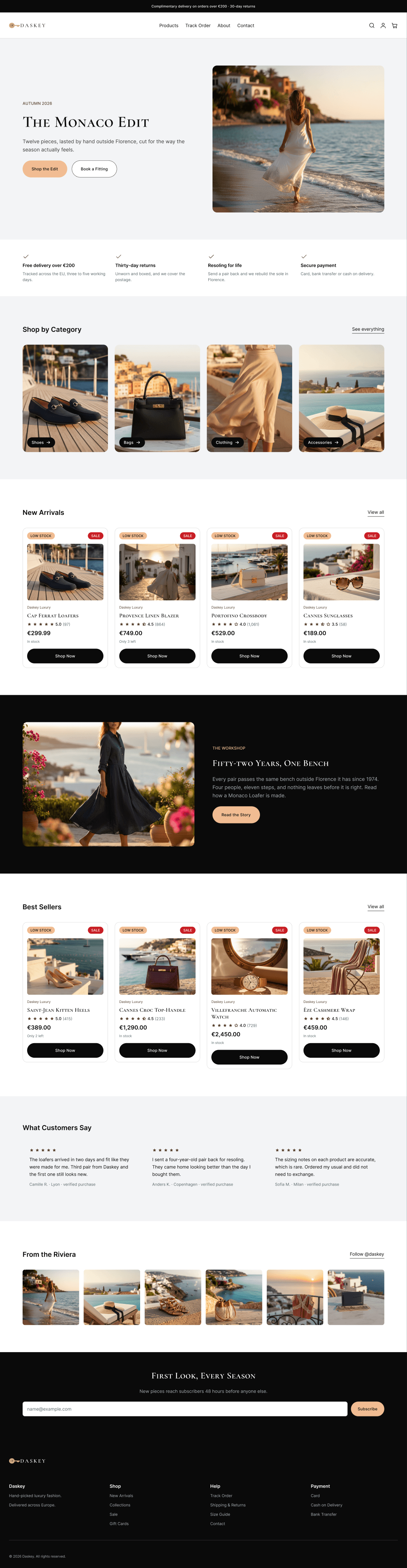
At this price point nobody buys before they know how returns work, whether the size is right and what happens if the card is declined. I designed all nineteen screens, including the ones where it goes wrong.
How this was designed
The problem
At this price point nobody buys before they know how returns work, whether a 38 here is a 38 elsewhere, and what happens if the card is declined. On most fashion stores those answers arrive after the basket, or not at all. The brief was to answer them earlier, keep the high-end feel, and design the failures rather than pretend they do not happen.
What I did
Built the shared parts first — colour, type, spacing, then buttons, inputs and cards — and only then assembled screens from them. Nineteen screens followed, each named for one state. Every section sits in a layout that reflows, so narrowing the frame stacks it for a phone rather than breaking it. Last came the prototype, linking all nineteen screens into one walkable flow.
How I got there
Compared luxury fashion stores at a similar price point for where each one puts returns, size detail and payment information. Wrote three personas from that comparison, each with stated needs rather than adjectives, then two storyboards — one where the purchase goes through in half an hour, one where four things go wrong. The journey map scores how the buyer feels at each of six stages and names the screen that carries it.
What came out of it
A complete store design: nineteen screens, one shared set of parts used six hundred times, and a prototype that walks the whole flow. One gap is left open on purpose — the homepage promises resoling for life and there is no screen to book it. It is marked as missing in the story map, the journey map and the negative storyboard rather than quietly dropped.
The screens
Why it works that way
Size measurements in centimetres on the product page, because a 38 is not a 38 everywhere. Ratings printed on the card, not revealed on hover, since hover does not exist on a phone. The declined-payment screen keeps the basket and the address and asks only for the card again. Four colours from the original palette were replaced because they failed contrast against their own background — the closest readable version was used instead.
Behind the design
What I handed over
Common Questions
Why design the screens where things go wrong?▼
Because that is where the order is lost. A declined card, a sold-out size and a wrong password each have their own screen, and each keeps what the buyer already entered so the recovery costs one field rather than the whole form.
There is a missing screen in the story map — why leave it visible?▼
The homepage promises resoling for life, and I did not design a screen to book it. Removing the promise or hiding the gap would both have been easier than admitting it. It stays marked in three places so it is the next thing built, not the thing nobody remembers.
How does the design handle phone screens?▼
Every section is built to reflow rather than to a fixed width, so narrowing the frame restacks it. I tested each screen at 390 and 768 pixels wide and fixed the overflows until there were none.
Your store next
Send me your store link — I'll record a free 5-minute audit
You get a short video walking through what is costing you orders — the product page, the basket and the checkout. No call, no obligation.