EveFlow — Cycle and Wellness Tracker App
A tracking app is only useful if people open it every day. I designed the landing page, the sign-up and the daily log around that one requirement.
How this was designed
The problem
A cycle and wellness app has to feel approachable rather than clinical, handle sensitive personal health data, and still be opened every day. Most of the design work sits in making the daily log short enough that logging becomes a habit rather than a chore.
What I did
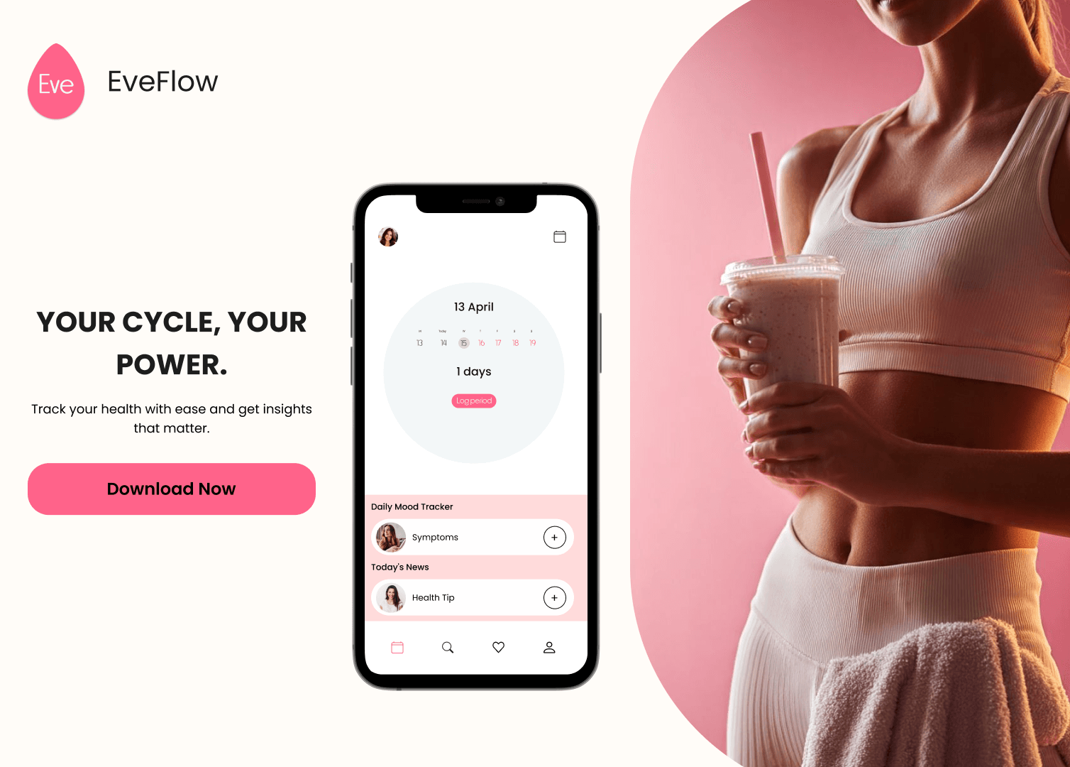
Started with the landing page to settle the voice and the order of features. Cut sign-up to three steps — account, cycle basics, goals — so the dashboard arrives quickly. Built the tracking screen around a cycle calendar with tap-to-choose mood and symptom chips, so a day can be logged in a few taps.
How I got there
Went through the sign-up flows of the leading cycle and wellness apps to compare how much they ask for before showing anything useful, and how they explain what happens to health data. Most collect a great deal up front, which pushes the first useful screen further away.
What came out of it
A complete design spanning the marketing landing page through to the core app, with sign-up at three steps and a daily log that takes a few taps.
The screens
Why it works that way
Soft, warm tones instead of clinical white, so opening the app does not feel like a medical appointment. The cycle calendar is the first thing on the dashboard, with predictions visible without tapping. Daily logging lives on the home screen rather than in a menu. Privacy is explained during sign-up in plain language, not as small print.
Behind the design
What I handed over
Common Questions
How did you handle sensitive health data?▼
Privacy is explained during sign-up in plain language rather than legal copy, and it is framed around what the user gets, not what is collected.
How do you keep daily logging from feeling like a chore?▼
Moods and symptoms are chips you tap rather than fields you fill, the screen opens on today's date, and a short insight appears straight after each log.
Your store next
Send me your store link — I'll record a free 5-minute audit
You get a short video walking through what is costing you orders — the product page, the basket and the checkout. No call, no obligation.