Pharma — Wellness E-commerce Store Design
Someone buying a supplement online has nobody to ask. I designed the whole store around that, then rebuilt it to the standard EU shops have had to meet since June 2025.
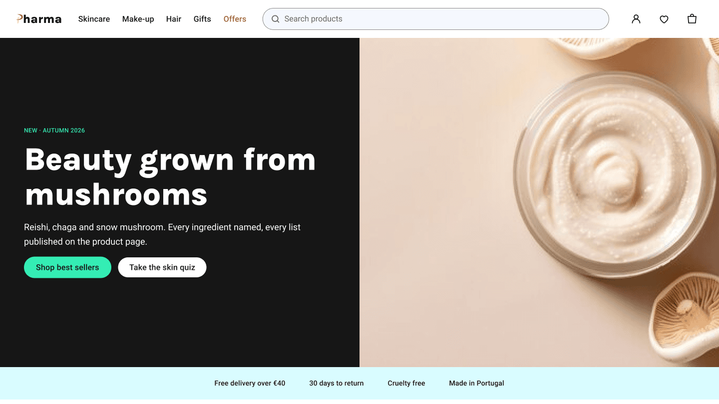
How this was designed
The problem
Someone buying a supplement online has nobody to ask. If the ingredient list, the dosage and the returns policy are not on the page, the tab closes. Then a second problem: since June 2025 a shop of any size selling into the EU has been expected to work for people who navigate with a keyboard or a screen reader, and to say in public where it stands. This shop had never been checked for either.
What I did
Drew every screen as grey blocks first, so the argument was about what goes where before anything looked like anything. Built the missing screens out of the same buttons, forms and cards as the rest, then adapted each one for the phone. Wired the lot into a prototype you can click from the homepage to the receipt, and separately from each failure point, because that is where shops lose people. Last, I measured every piece of text on every screen against the colour behind it.
How I got there
I went back through the shop screen by screen against what a buyer can actually do on it. Two kinds of gap turned up. First, promises the shop was breaking: the search box, the wishlist heart and four of the five menu categories led nowhere, and on the phone the filter button opened nothing at all. Second, what shops do now that this one did not — a bag that opens over the product instead of throwing you onto another page, a full reviews page, and a chance to check the order before the money moves.
What came out of it
Thirty-six screens across desktop and mobile, including the ones most shops skip: loading, sold out, no search results, declined payment, empty wishlist. All of it clickable as one prototype, with an accessibility statement written from what was actually tested rather than what was hoped for.
The screens
Why it works that way
Adding to the bag opens a panel over the product instead of jumping to the bag page, so nobody loses their place mid-shop. The order gets a review step before the payment goes through. Every control now shows a visible outline when the keyboard reaches it, which the shop had nowhere before. And the accessibility statement names what still does not work and gives a date for fixing it — a statement claiming everything is fine is the one nobody believes.
Behind the design
What I handed over
Common Questions
Why rebuild a concept you had already finished?▼
Because the rules moved. Since June 2025 a shop selling into the EU has been expected to work with a keyboard and a screen reader, and to publish where it stands. I would rather learn that on my own project than on a client's.
How did you build trust for health products?▼
Ingredients, dosage and reviews sit on the product page itself, above the fold where they decide the purchase, so a buyer can judge the product without leaving it or asking anyone.
What was the approach to the mobile version?▼
The desktop layouts came first, then each was adapted for the phone — sections stacked, the filters moved into a panel that slides up, and the bag became a sheet from the bottom rather than a separate page.
Your store next
Send me your store link — I'll record a free 5-minute audit
You get a short video walking through what is costing you orders — the product page, the basket and the checkout. No call, no obligation.